The big troika of smartphone navigation apps are Google Maps, Waze, and Apple Maps. I believe that recently Apple has brought its map app up to parity and then some.
On November 28, 2007, Google Maps for Mobile 2.0 was released.On September 23, 2008, coinciding with the release of the first Android device. Google then broadened its market with an Android version. And not to be left out in the cold, Apple inevitably adopted a version of Google Maps.
With the announcement of iOS 6 in June 2012, Apple took a leap of faith and debuted their own Apple Maps service.
It was obvious that Apple’s initial foray into the maps app market was amateur, at best (perhaps a preschooler led the development team). And it remained that way for a long time.
Google had it all over them for many years. And recently Waze has entered the market with the introduction of crowdsourcing traffic conditions in real time.
It was great to have a GPS system within your smartphone. (BTW, do we really need to call them smartphones? Why can’t we simply say that we have our computer with us. Let’s agree that all others have flip phones or coffee cans with twine.)
Being a fanboi, I quickly moved to Apple Maps when it was released. What a mess. Routes seemingly suggested by a sadomasochist, seeing if you would follow on a dare. But I went with it for awhile, inevitably switching back to Google to relieve the pain.
As I said, Waze has recently appeared bringing with it the concept of incorporating crowdsourcing, a new concept to a staid maps market.
But now we’re on iOS 12 and Apple has given Maps a huge dose of love. Under the ‘rules’ which the market operates, Apple ‘borrowed’ a number of functions from each competitor. And as is typically Apple, I argue that they have done an excellent job of finessing them.
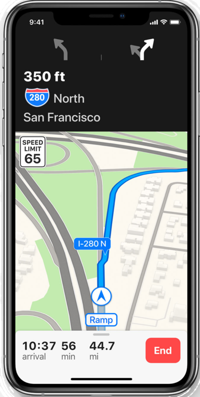
Maps is being rebuilt from the ground up to better reflect the world around you. The new underlying map uses Apple data and features enhanced geographic context like pedestrian paths and parks, more detailed building outlines and parking lots, better road network coverage, and more. You’ll also be able to get where you’re going with improved routes, whether you’re on the road or on foot.
In the beginning they were the map app with training wheels (one of them broken, at that). And it took them a fair amount of time to get where they are now. But I feel that it paid off.
With the release of iOS 12, I have found myself back with the greatly improved Apple Maps and elated with my choice, without any measure of guilt.
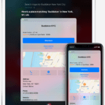
There’s Flyovers, Indoor Maps (great at airports), Public Transit info, a host of other things including sharing your maps on all of your devices. Even though it’s been around for a while, I particularly like the last feature when I receive a last minute call while at my desktop. Find the location that I have never been to before and send the directions over to one of my mobile device’s immediately is a time saver.
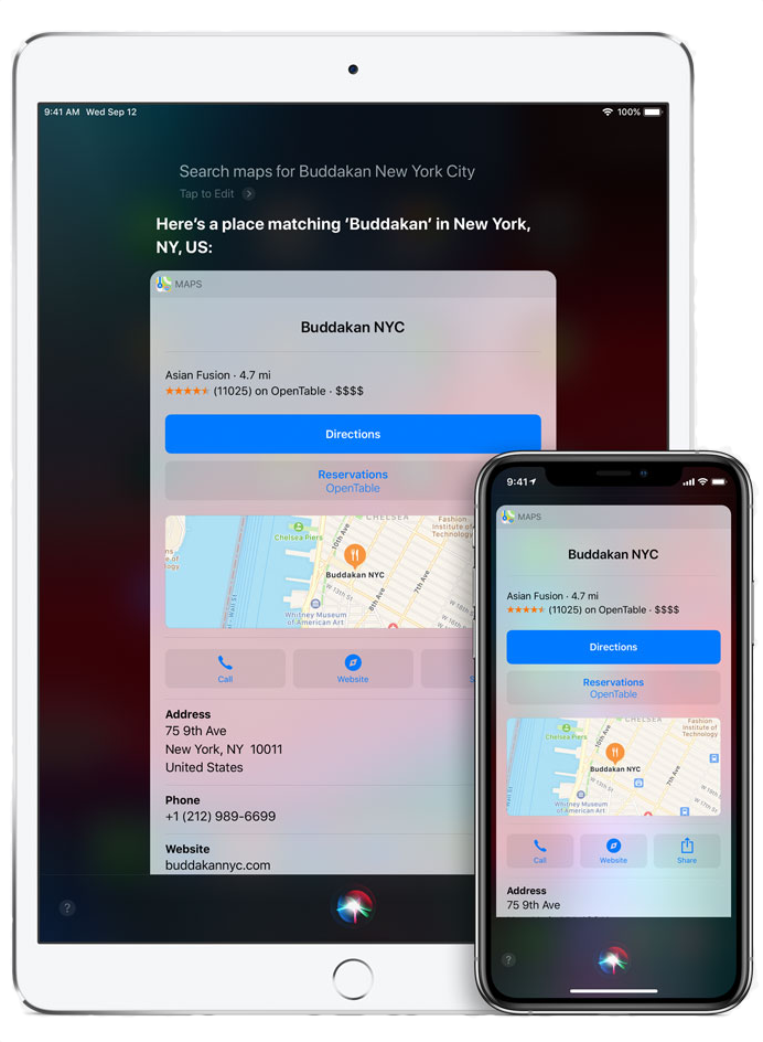
(My guess is that Apple used it’s time-honored technique that goes back to the iPod. Use buyers as your test subjects. Listen to what buyers like about their competition’s devices/apps, discern what they don’t like, and pay special attention to their wish lists. Finally, address all three issues then put Apple’s twist on it.)
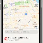
As for the UI, the three are roughly the same. But to my eye, Apple’s graphics look a bit more polished. One example, it appears to me that they list more landmarks (which is very important to me when driving as I can’t remember street names but can instantly remember visual clues).
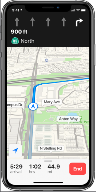
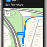
Another example would be the header that shows you what lanes to use or not to use. Google chose green for their background color. I found Apple’s black background much easier to see at a glance, particularly in daylight.
I also found Apple Maps co-pilot much more valuable. It alerts me two miles before my next turn, then one mile, then half a mile, and so on. It won’t let me forget that I have to take action but soon.
It also lists the exit number in the header as the others. I was surprised, however, because knowing my route and destination, it listed my exit four exits prior to reaching it!
It has all the basic features that you find on the other map apps: places to grab some grub, gas stations, banking services, etc. The only thing that I could ask for is that they would ‘borrow’ Waze’s crowdsourcing. Face it, this is the gem that put Waze so much in demand.
Apple’s detection of congestion has grown by leaps and bounds. On one of my recent excursions, Siri informed me that there was an accident up ahead but that the route that I was on would still be the fastest route to reach my destination.
Compare that to several years back when it would send one on a mind-boggling knot of back roads that would cause you to drive an extra dozen or so miles!
So, that’s my USD $.02. I’m sure that there are plenty of you that are calling me many different names at this moment. Everyone seems to have their preferred map app.
But from my experience, Apple created a map app “for the rest of us” and I’m more than satisfied with the results.
©2019 Frank Petrie
fpetrie/about.me

0 Comments