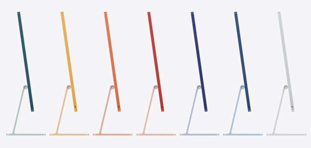
After the conclusion of Apple’s April event, many You Tubers and bloggers (myself included) began our assault on the new M1 iMac. Personally, I likened the design to a 5th grader who used the iPad software feature where you can make a square, circle, rectangle, what-have-you perfect by merely drawing the shape then holding the Pencil in place when finished which would then signal the tablet to snap the shape into looking professional.
The three main complaints where the chin, the two-color aesthetic, and the sacrificing of ports for thinness. And we tore Apple apart for days for releasing such an abomination. It seemed the main object was that the iPadPro HAD to be thin (looking at you Jony). We were back in the land of form dictates function.
Now that we have all had time to stare at it and learn all about the internals, a fair number are now pumping out rationalizations as quickly as possibly can. Mostly they seem to appreciate the colors but wish they wrapped the matte finish around and onto the front chin. Alright, I can go with that.

THE CHIN. I steadfastly believe the chin should be history. The iMac’s back will be seen by no one as it’s going to sit on my desk against the wall. There’s no rationale to hold it to the standards of a portable. Although my late 2015 iMac with its (con)Fusion Drive is about to become a portable any day now when I toss it out my third floor apartment window. The sacrifices made to achieve thinness of the iMac is of no import in this case as it merely makes it look like a third-party knock off.

COLORS. Even more backpedaling seems to deal with the colors. Many are not in agreement with the two-tone effect of a solid color on the background (which contrary to Tim’s belief that that’s the first thing people will see, when actually it’s the first thing your wall will see) and the anodized version of the color on the chin. I’ve seen several You Tubes where they have come to forgive Apple as this iMac is meant for the entry-level market. (I find it interesting their definition of an entry-level market when you think of the power this device possesses.)
Even stranger, I believe one wag referred to it as the ‘Zoom iMac’, meant to appeal ‘to a female demographic’. Personally I don’t like the matte finish but then again I may be prejudiced because I remember the introduction of the ‘jelly bean’ and its glossy case. I actually like that they’re bringing color back. It makes the iMac seem more fun to work at and it tickles my eyes.
But they’re still finding fault with the anodized chin. With that I’m in all honesty on the fence.
THE THICKNESS. I for one am never reneging on this primary disappointment. I believe if they could place the 3.5mm port on the side, there is no reason they couldn’t have placed card readers on the side, as well. Yet to keep it thin, they placed all of the internals directly behind the chin in order to achieve the iPad aesthetic.

It simply could have been made nominally thicker to accommodate the interiors, the card reader, and the audio components as Apple has brilliant engineers and designers. No one would have been upset, or even noticed for that matter, if it had been a wee thicker. Users would have rejoiced at the return of necessary I/O. There’s no need for a desktop computer to weigh ten pounds, either. It’s non-sensical.
I heard one reviewer who went as far to say as they were going to place an Apple sticker on the chin to make it feel more normal. Huh?
Now, an interesting wrench has been thrown into all of this. Amazon and other retailers are selling the M1 MacBooks and MacMinis at discounted prices. I can purchase a M1 MacMini, a sizable and inexpensive 4K monitor, and external SSDs for roughly the same price as a tricked out iMac 24”.
So now I have to wonder, what is my incentive to bother with an entry level iMac? Another first-world problem.
©2021 Frank Petrie

0 Comments